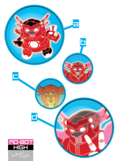
I have hit a bit of a mental block on this, and so am polling it here! If you have any preferences for which of these you like, if you could let me know in the comments here or on twitter, that would be very much appreciated!
(Please note: they would all be the same size, 25mm - I've just made some bigger and some smaller in this image for the highly technical reason that I thought it looked nice that way.)
 Hey, I've been meaning to blog for a while about the first three DFC Library titles: Good Dog, Bad Dog, Mezolith and The Spider Moon. I'm a huge fan of all three and wanted to write a little introduction to help people who maybe didn't read them in the DFC get properly excited about the sheer awesomeness soon to be heading their way. Anyway, I haven't had a chance to get round to it yet, but handily there is now an online eBook type preview of the three available over on the Random House website! Go and have a look why don't you!


My faves are A and C. I think you need full-figure to do the 'bot justice, but close-up on the face works better for Asha. Love those electric colours!
ReplyDeleteI'm not a fan of C at all. It's just a bit flat and unengaging. A, C and D are better, and my favourite of the lot is A. Or maybe D.
ReplyDeleteBoth?
A, B and D are better obviously. C is not better than C. What a numpty.
ReplyDeleteI like D best.
ReplyDelete