Brilliantly bad (but good) in your face artwork and the monochrome and red styling just sums up the halcyon days of the Mick Anglo studio churning out this kind of stuff in 1950's London.
I like it the awkward and stilted way myself. If the girl was more cutting we'd feel the reaction was specific to her, ie she becomes a very defined character. This way, we get the sense it's pretty much the reaction he'd get from any girl.

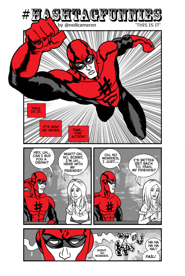
Hmm... love the art and set up, butmaybe the girl should have been more cutting?
ReplyDeletePanel 2: What!? Drink with some anonymous superdork? No way...
Panel 3: Try me again when you've been on the cover of Heat.
I dunno, that sounds a bit pithy. I was kind of going for 'awkward and stilted'. (No really, I was)
ReplyDeleteBrilliantly bad (but good) in your face artwork and the monochrome and red styling just sums up the halcyon days of the Mick Anglo studio churning out this kind of stuff in 1950's London.
ReplyDeleteI like it the awkward and stilted way myself. If the girl was more cutting we'd feel the reaction was specific to her, ie she becomes a very defined character. This way, we get the sense it's pretty much the reaction he'd get from any girl.
ReplyDelete