Showing posts with label process. Show all posts

Monday, 10 September 2012

How To Build a Ghost Pirate Dinosaur Ship


This week's issue of The Phoenix features the rip-roaring conclusion (and that's not just hyperbole: THINGS GET RIPPED AND THERE IS A LOT OF ROARING) of our recent Pirates of Pangaea mini-epic, Ghosts of Mathrak Chu! And so it seemed a good time to (a) remind you of this fact, so you can all run out and buy a copy, and (b) share a little peek at some of the art and how it was put together.

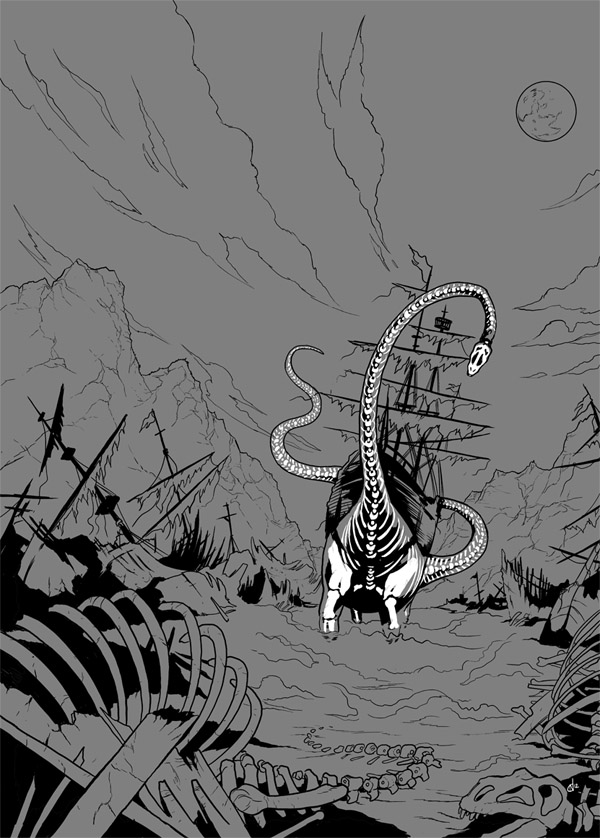
This story, of course, featured GHOSTS PIRATES riding on GHOST DINOSAURS, because I guess Dan had not quite sufficiently found ways to blow my mind with things that were awesome / painfully difficult to draw. Anyway, it took a bit of figuring out but I was really happy with how it turned out. "Spooky Dio De Los Muertos Dinos" was the general effect I was going for, and it involved adding a couple of extra stages in the inking and colouring. First I'd draw the regular dinosaur:


...and then do the skeleton as a separate layer. I've added a grey underlayer to these pics so that the skeleton was visible and, basically, so my writer and editor could get some idea what I was going for...


And then it was just adding the colours and a bit of glowy misty effects. Almost like making Mo-Bot Dinosaurs, really (and there's a whole other story waiting to happen...).

Here's a couple more pages!


Aaaand one more, this time with Sophie and Cornflower JUST PLAIN BEING AWESOME:


There were some pages in this thing that weren't splash pages, I swear.

Anyway, thanks to everyone who's said lovely things about our little return to Pangeaea, it's wonderful to hear people are enjoying it. I'm currently hard at work on our NEXT instalment, which is going to be another giant whopping epic adventure, full of - guess what - insanely awesome and exciting new ideas from Dan that are horribly hard to draw. COMING SOON TO THE PHOENIX! 

ALRIGHT, SOON...ISH!


Wednesday, 27 October 2010

How To Draw Comics The Neill Cameron Way!

STEP ONE: DRAW THIS:

1-mo-bot-high-neill-cameron-thumbnail

STEP TWO: MAKE IT LOOK LIKE THIS:

mo-bot-high-neill-cameron-5-lettered

I go into slightly more detail in this 'Directors Commentary' piece over on the Forbidden Planet blog, although for reasons of space I still leave out several steps, mostly consisting of nervous breakdowns, crippling back pain, and sobbing.

I'm only joking, kids! Comics are fun!

Look, here are some mo-bot high stickers. On a potty.

Thursday, 15 July 2010

Making Mo-bots


1.Asha (our hero)

I've been drawing a few promo pics of some of the characters from Mo-Bot High - haven't quite figured out what to do with 'em, just fancied drawing some mo-bots really. Anyway, as an experiment / fun thing, I thought I'd try posting the results to my twitter account at each stage of completion, so people could follow how I produce an image, from roughs to colours.

Anyway, here are the collated results!

2. Sophie (the cool one)


3. Shelly (*thinks* she's the cool one)


4. Sasha (the baddy, the nemesis, destroyer of worlds)

Will post the results here whenever I fgure out what I'm doing with 'em. I'm thinking some kind of big standup poster to take to shows and such...

Tuesday, 20 January 2009

Early-Version Mobot Cover

Fun things! Here is an early, unused version of what ended up being the cover for issue 9 of The DFC:


I ended up redrawing it and obsessively tinkering with the colours about 17 more times, but have now characteristically decided that - aside from Asha looking a little green around the gills - this was probably my favourite version after all.

But then again, I'll probably change my mind again next time I look at it.

The moral: STOP MESSING WITH IT, IT'S FINE.

Wednesday, 7 January 2009

Rrraaaaarrggghh!!!!

Here's a little snippet of a thing I'm drawing at the moment - inks and backgrounds removed, this is just the colour layer.
I just thought it looked cool like that!

Thursday, 13 November 2008

Fashion!

I have to draw model sheets for myself otherwise I tend to get very confused and when I look back at a strip, realise that everyone's outfits have been changing from panel to panel.

Here is the model sheet for the look Asha and Shelly have been rocking in the last few episodes of Mo-Bot High.


I'm getting quite into drawing patterns.

Hey, you know what? Go read the DFC!

Sunday, 19 October 2008

The Big Picture

At the moment I'm doing all my pencilling and inking digitally, using a program called Manga Studio (mostly for reasons of efficiency, although also 'cause its just really quite fun). One of the cool things about the application is that it treats a project as one story, not just a whole bunch of unrelated image files. So you get to look at your whole story spread out before you, and get a great sense of progress as the blank pages get filled in as you go along.

I am currently enjoying that sense of satisfaction on Season 2 of Mo-Bot High, but of course I can't show you any of that here, as it is filled with exciting and dramatic plot developments that you will have to go and subscribe to the DFC to enjoy. But here is a little behind-the-scenes look at the story file for season 1, simply because I think it's quite a cool thing to look at. (If, that is, you are a massive process nerd like me.)


It's all very small, anyway. Hopefully no-one's enjoyment of the story has been spoiled this way!

Did I mention that Season 2 starts next week? Its going to be pretty skill.

Tuesday, 23 September 2008

Illustration Process

I thought it might be (mildly) fun and / or interesting to show the process I go through in producing an illustration - in this case a t-shirt design for AR Mcguire - steadicam operators extraordinaire. This was for a promotional t-shirt to be given away to cast and crew on the set of the new Streetfighter movie, then shooting in Thailand.

Step 1: Roughs

I started with a rough pencil sketch, based on the brief - to produce an illustration showing the AR steadicam operator as a Streetfighter-style character, surrounded by the actual characters in the movie. I didn't worry too much about likenesses etc. at this stage, as it was just to get the basic gist of the design in place.

This then got changed and added to a couple of times, as the client requested additional characters and various minor alterations.

1. First version.

2: Balrog pops up top right, M. Bison (top centre) has his dodgy arm attended to.


3. A new challenger! And another. I forget these guys' names.

Step 2: Inks


Once the client was happy with the roughs, I then inked the design. I usually do my 'inking' in Manga Studio, but decided to try a different approach for this. I started by drawing in the white highlights on the characters, and then filled in the black shapes behind them. I really enjoyed working this way, and love the high-contrast vaguely-Frank-Miller-y effect it gives you. I'm totally going to try drawing a whole comic in this style. One of these days. When I get a minute.

At this stage I had to use a lot of photo reference to get the actors likenesses right - I'm pretty pleased with the result - while being quite abstract / stylised, I think they do kind of look like the people they're supposed to be. (I forget some of them, but casting highlights include Kristin Kreuk as Chun-Li and Michael Clarke Duncan as Balrog.)

I stuck in a red background to give these JPEGs a nice high contrast look, but the actual files were sent to the client as unflattened files with a transparent background, so they could be printed on the t-shirt colour of their choice.

I produced a couple of versions, one with the black figure art for all the characters and one with it only on the camera operator.


I think I like the second one best.